Your website is likely to be your company’s single most important marketing tool. According to a KPMG report on global online consumers, 47% of us visit a company’s website before making a purchase. So if you don’t currently have one, it’s really time you joined the 21st century.
Assuming you do have a website it’s fair to ask how confident are you about its effectiveness:
- Is it delivering in terms of the goals you’ve set for it?
- What KPIs and benchmarks are you measuring your website’s performance against?
- How are you managing the process of improving it?
A big part of seeing a gradual improvement in the performance of your website and/or app is having a strong sense for the efficacy of your UX and UI. This post collates some of the thoughts our designers here at VIMI have regarding best practices for UI and UX.
First, what are UI and UX?
While we often see UI and UX used as interchangeable terms, it’s important to understand they’re far from it, and clarify the differences between them:
- UI stands for User Interface – It relates to the appearance and aesthetics of a website/application.
- UX stands for User Experience – Commonly understood as how users interact and complete their goals while using the website/application.
While UX is often viewed listed above, a deeper understanding of the discipline is one that sees it as responsible for designing all aspects of a user’s interaction with the company, its services, & products. We find it useful to think of UX as HOW YOU MAKE THEM FEEL.
Why the confusion?
The primary reason these two concepts get mixed up so often is because for the purposes of website, app and software design they are indeed closely related, and delivered by the same roles. Essentially, UI is considered a part of UX, and both are the responsibility of the design team, with the assistance and guidance of the product and marketing teams.
Any product or service, whether it’s a milk carton or a music streaming website, needs to undergo a process of UX design to determine how users will be experiencing it.
Think for a moment about the milk carton – How do you think it came to have a drinking straw attached to its side? That evolution in this product’s format is the result of a UX process that determined that adding a straw to every package will improve the overall experience consumers have with the product.
Another example – Why do you think all the play and pause buttons of every music streaming site always use the same icons? This is another example of a UX paradigm. Here again this was a process of evolution where over many years a convention was established wherein a certain set of icons became globally recognized as meaning “Play”, “Stop”, “Forward”, “Rewind” and “Pause”. Once these icons became a convention it was obviously a better design choice to adopt them for interfaces, than force users to learn a new interface paradigm.
The difference between these two examples is, for our purposes, that only the music streaming website has an interface, and therefore, needs UI design as well.

Keys to excellent UX and UI
As with all design disciplines, UX and UI have evolved widely tested, and therefore widely accepted, conventions for best practice. Following these is paramount for guaranteeing our user’s the best possible experience while using our products, which of course supports the performance of our business. Since UX is responsible for the big picture, it’s the foundation on which the UI can later be considered. Here are a few important things to keep in mind for UX.
Who are our users?
A preliminary step to our product development process is validating any assumption we may have about who our target audience actually is. The type of questions we’d want answers to could be:
- BACKGROUND: Basic details, education, hobbies, etc.
- DEMOGRAPHICS: Gender, age, income, urbanicity, etc.
- IDENTIFIERS: Buzz words, mannerisms, tech skill.
- GOALS: Primary and secondary goals when using our service.
- CHALLENGES: Primary and secondary challenges when using our service.
- HOW WE HELP: How we solve the user’s challenges and help them achieve their goals
An example of a persona profile we’d aspire to have for an online wallet product could be something along these lines:
Sophie Korslund
- Swedish, 31 years old
- Married to Jon + 1 child – 2 year old girls
- Expat family in Bangkok on a 3-year contract
- Licensed clinical dietitian moonlighting in Bangkok
- Gets clients via her column in the local family magazine
- Hobbies / activities – Is an active church group member, hiking, scuba
- Concerns as related to the service:
- Can’t practice her profession legally & is worried about accepting Bank transfers, but dislikes having to request cash.
- Can’t have her own bank account & relies on borrowing her husband’s credit card.
Understanding our users
The most crucial factor in determining how well a business performs is the extent to which we, as a creator in business, understand the users using our solutions. Understanding our users means centering around and focusing our product development plans on their characteristics, lifestyles and preferences. This is known as User Centric Design.
For example:
If our business is senior assistant application, we must consider this audience has unique characteristics that differentiate them. Considerations could be:
- Stressing readability.
- Simplified navigation.
- Easy access to human backed help.
- etc.
For a B2B application targeting power users our considerations would likely be very different and could include things like:
- Speed of access to features.
- Multiple options for customization.
- Personalization of KPI dashboards.
- etc.

Talking to users
While we’re likely to have intuitions about our users, the only way to validate our assumptions is by meeting users and conducting in-depth interviews with them.
It consistently amazes me how often we speak to entrepreneurs who have fantastic ideas, detailed execution plans, and optimistic financial projections, but have yet to sit down for a chat with even one of their intended customers…
The type of questions we could find it highly valuable to ask would be:
- How do they interact with services similar to ours?
- What do they like and dislike about them?
- What features and aspects of our service do they find most valuable?
- What dollar value would they assign to these features?
- What aspirations do they have for future releases of our product?
If we’re engaged in a process of trying to improve our existing website, we could show our interviewees a prototype of the new version and compare it with the current/previous one in order to get feedback – This simple process always generates valuable feedback.
How to interview?
When conducting interviews an important point to keep in mind is that people are often unable to articulate what they really want, or may be shy about offering criticism. This is doubly true in cultures that place importance on values of deference to seniority.
It’s our responsibility to be attentive not only to what people say, but also to what they’re not saying. Following body language and being attentive to nuance is key.
Another important tip is to follow up with our interview subjects a few days later – Often the difference of a couple more days of thinking time will yield further insights they’ll be happy to share, not to mention that it’s a good customer engagement practice anyway…
The twin imperatives – Simplicity and Speed
Think of any successful web platform you’re familiar with, and it’s likely that when you consider what you appreciate most about it, these two words come to mind: Simplicity and Speed.
It’s a harsh reality of running a web based business that users expect nearly instant gratification. Consumers have been spoiled by instantaneous search results, endlessly refreshing social feeds, and same day ecommerce deliveries. Like it or not, this is the playing field on which we’re all being judged.
Speed, and the impression of speediness, are as much reliant on the technology our products are based on, as they are on the ease-of-use users experience while using them.
Google’s rise to success can be attributed not only to the fact that it offered users faster and better search results than any of its competitors, but also to the fact that its interface was a radically simplified alternative to the norms of the time.
It’s now or never
If our users aren’t able to get the gist of the benefits our solution offers them within milliseconds of launching our landing page or app, we’ve probably lost them. For ever.
If however we’re able to convey to them, within a blink of an eye, that they’re in the right place for having their needs served then more than half the battle is won, insofar as turning them from casual visitors into valid business opportunities.
There’s of course a nearly endless list of details that we still need to consider insofar as our UX is concerned, but if we have speed and simplicity, we’re well on our way to a successful product.
Visual hierarchy
Let’s dive more into the UI side of things (still related to UX)!
If we had to choose one single area to which we must dedicate our attention in order to create a useful user interface, it would be the visual hierarchy of the elements on any given screen.
Simply put, visual hierarchy is the practice of arranging the texts, pictures and other elements of a screen in a way that implies the importance of each.
We’re all familiar with this concept – It’s at the foundation of every single graphic layout we’ve ever seen (think magazines, newspapers, posters, etc.).
The headlines on each page tell us what the story is about, while the call-outs, captions and subheaders make it easy to scan the page and pick out the story’s main points. Here are some of the tools at our disposal for creating a sense of visual hierarchy:
Layout
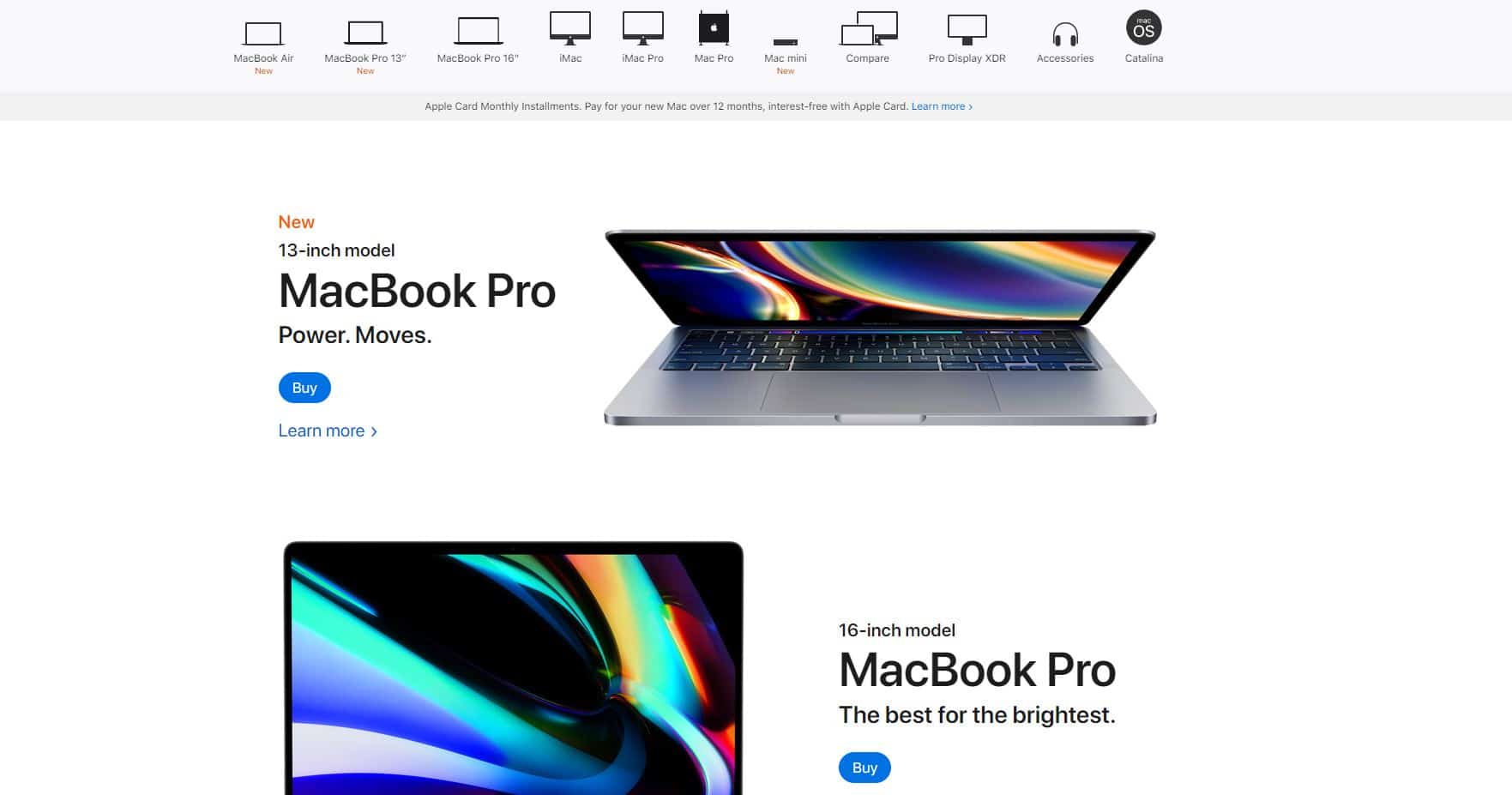
Our eyes, and more-so our mental faculties of perception, are immediately and instinctively drawn to bigger and bolder texts. We scan pages from the top of the screen downward, most commonly and easily by following an F pattern, or Z pattern. Since this is the natural order in which we view a screen, it’s a smart design choice to leverage this behavior by placing the main screen elements and calls-to-action accordingly. Here are a couple of examples:
Sizing and scale
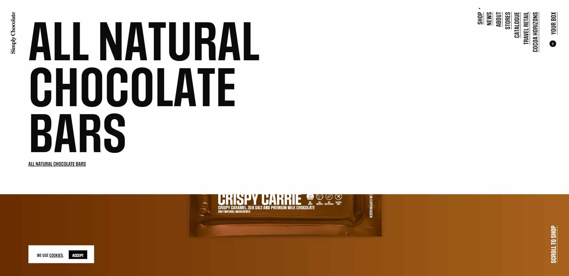
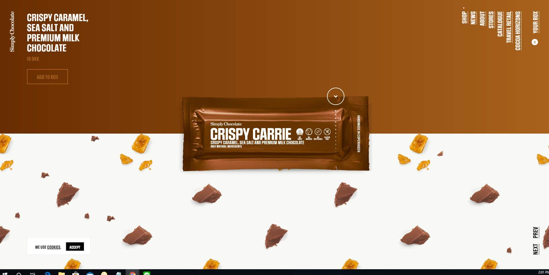
The easiest way to create a sense of visual hierarchy is by controlling sizing and scale of visual elements. BIG items will draw our attention first, and we’ll then use them as a scaling reference for the importance of everything else we see. For example, on the homepage of Simply Chocolate, our eyes are immediately drawn to the most essential keywords: All Natural Chocolate Bars. And, as we scroll down, we see each chocolate flavor one by one. This is a really good example of website/UI/UX design: aesthetically pleasing yet simple and straightforward.
Sizing and scale on simplychocolate.dk
White space
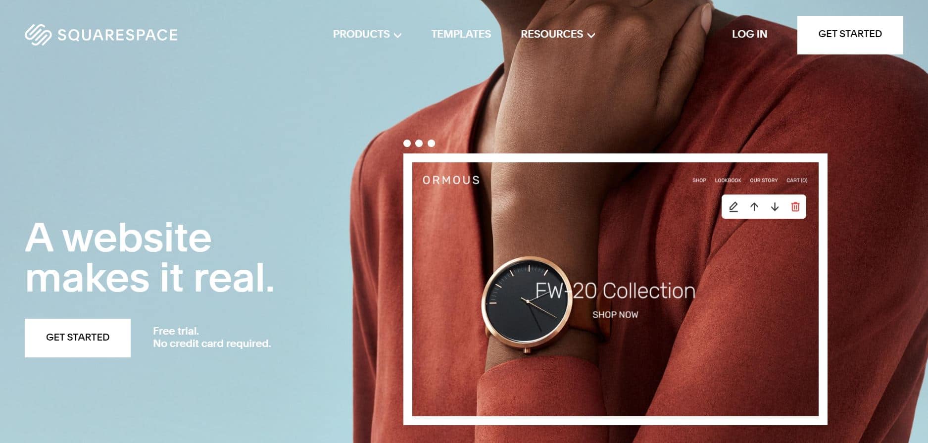
The empty spaces separating visual elements from each other are called white space (AKA negative space). The spacing of elements is another useful tool in denoting the relative importance of various screen elements. A common misconception is that white space is “wasted”. Nothing could be farther from the truth. Need proof? Justtryreadingthissentenceandseehowlongittakesyou…
White Space – Image: squarespace.com
Typography
Typography is the art of styling and designing fonts and text blocks.
The bolded sentence above is a simple example for how a combination of layout and typeface achieves emphasis and creates a sense of importance. Typography considerations also include fonts and alignment.
Typefaces
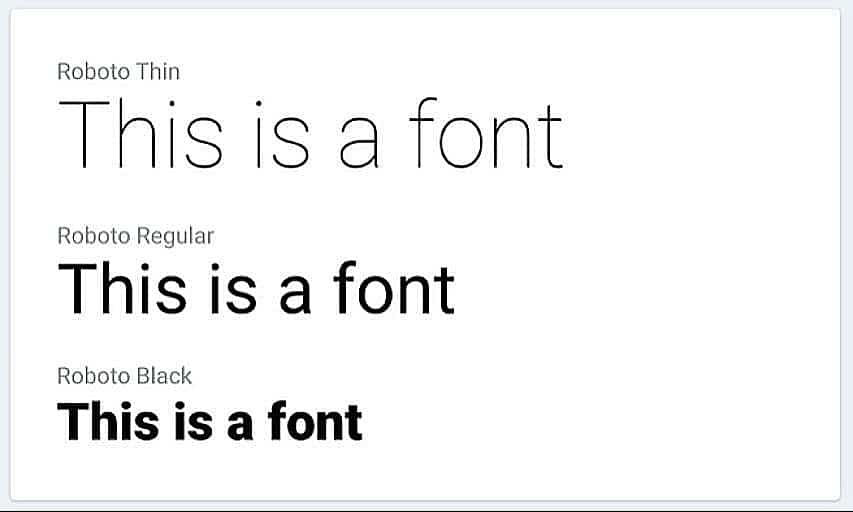
Typefaces are the varieties of sizes and weight within a particular font. These are crucial to the way users perceive the information on a website. Typeface conventions, and our choices to adhere to them, play a big role in how we creating visual hierarchy. Consider the example below. The text on the top row is the biggest, the the bottom row draws our attention due to its weight. This is a good example of how NOT to practice effective typeface design since the result creates ambiguity rather than clarity.
Typefaces – Source: medium.com
From UI back to UX
These brief examples regarding the seemingly simple task of creating optimally readable text blocks carry a greater significance than meets the eye, and relate directly to the paradigms of speed and simplicity we addressed earlier on.
Careful execution and adherence to these principles will make it measurably easier for users to understand our interface, and as a result speed up their comprehension processes, ultimately leading them to a feeling and impression of having a speedier experience.
Attempting to achieve a comparable increase in perceived application speed through technical and technological means is likely to be significantly more complicated and expensive. It’s here that we find one of the least appreciated qualities of excellence in UX and UI design – Ultimately they not only makes for happier users, but they also generate significant product development cost savings.
Conclusion
Now that we know (or are reminded of) some of the best practices for UX and UI, it’s time to develop a plan to implement them in our products for the benefit of our users and customers. Not sure how to begin? Reach out to us – We’re happy to help!


