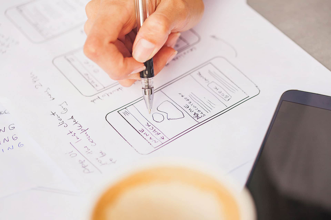
Today we’re going to look at how app UX design, and specifically notifications, trigger Completion Bias, and are central to why we can’t put our phones down.
“Nothing in life is really as important as you think it is while you’re thinking about it” is a quote from Daniel Kahneman, whose book “Thinking Fast and Slow” is the source for many of the ideas presented here.
We’re always focused on the present
What Kahneman means is that while objectively there are many things that are more important than whatever is in our mind, subjectively WE are always entirely focused on whatever it is We are thinking about at IN THE MOMENT. And so now our focus will be how Completion Bias keeps us addicted to our phones.
It’s time for some science!
Are you ready to see how this works? Write down a to-do list with two tasks on it, but be sure to list at least one thing you can complete right away. For example:
- Read an email
- Reply to a client
- Etc.
It really doesn’t matter what, as long as you can do it RIGHT NOW. Have you completed your task? Great! Take a marker and check it off your list. Feels good, doesn’t it?
Completion Bias feels good
Checking off to-do lists literally gives us a high Our brains are wired to reward us for taking positive actions by giving us a dose of Dopamine. Dopamine is one of the neurotransmitters responsible for making us feel good. This reward process is known as completion bias, and as we’ve mentioned before, like all cognitive biases, it’s hard-wired in your brain. We are all affected by this phenomenon.
Completion bias’ power comes from the fact that it evolved as a survival mechanism designed to motivate us to hunt, collect food, and do all the other things necessary to keep us alive. While we may not have to hunt to stay alive anymore, completion bias is baked into our operating system by millions of years of evolution, and it’s triggered by even the most mundane of tasks, like completing online forms.
Back to Dopamine…
Dopamine is a naturally occurring chemical in our brain. It’s also very similar to a less natural chemical, one we recognize as being a) very powerfully linked to feelings of happiness, b) very addictive. Dopamine looks almost like Cocaine. Both chemicals are very similar, and both are accepted by the same receptors in our brains. It’s important to understand that although Dopamine is produced by our own body, in one respect at least, it behaves exactly like it’s more malignant look-a-like. Like any drug, the more Dopamine you use, the more you need to get the same level of high.
How does this relate to app UX design?
Now you may ask how has this got anything to do with my phone usage and app UX design? The answer is really quite simple. Remember how our brain rewards us for task completion? Well, our brain sees swiping away notifications, as task completion, and every notification we swipe rewards us with a dopamine hit.
Are app UX designers Dopamine pushers?
The more apps and notifications we handle, the more Dopamine we get. Most UX and app designers have no clue that this process is taking place, but by integrating timely and useful notifications into their apps, they’re giving us an ever-increasing opportunity to get Dopamine fixes.
Flooding our brains with Dopamine this way means that our brain’s receptors need ever-increasing levels of Dopamine to get the same buzz …and so we go back to our phone: More apps => More notifications => More Dopamine => Less sensitive receptors => More apps… And that’s how we become literally addicted to our phones. There’s an easy way to break the cycle, but that’s the topic of another post…