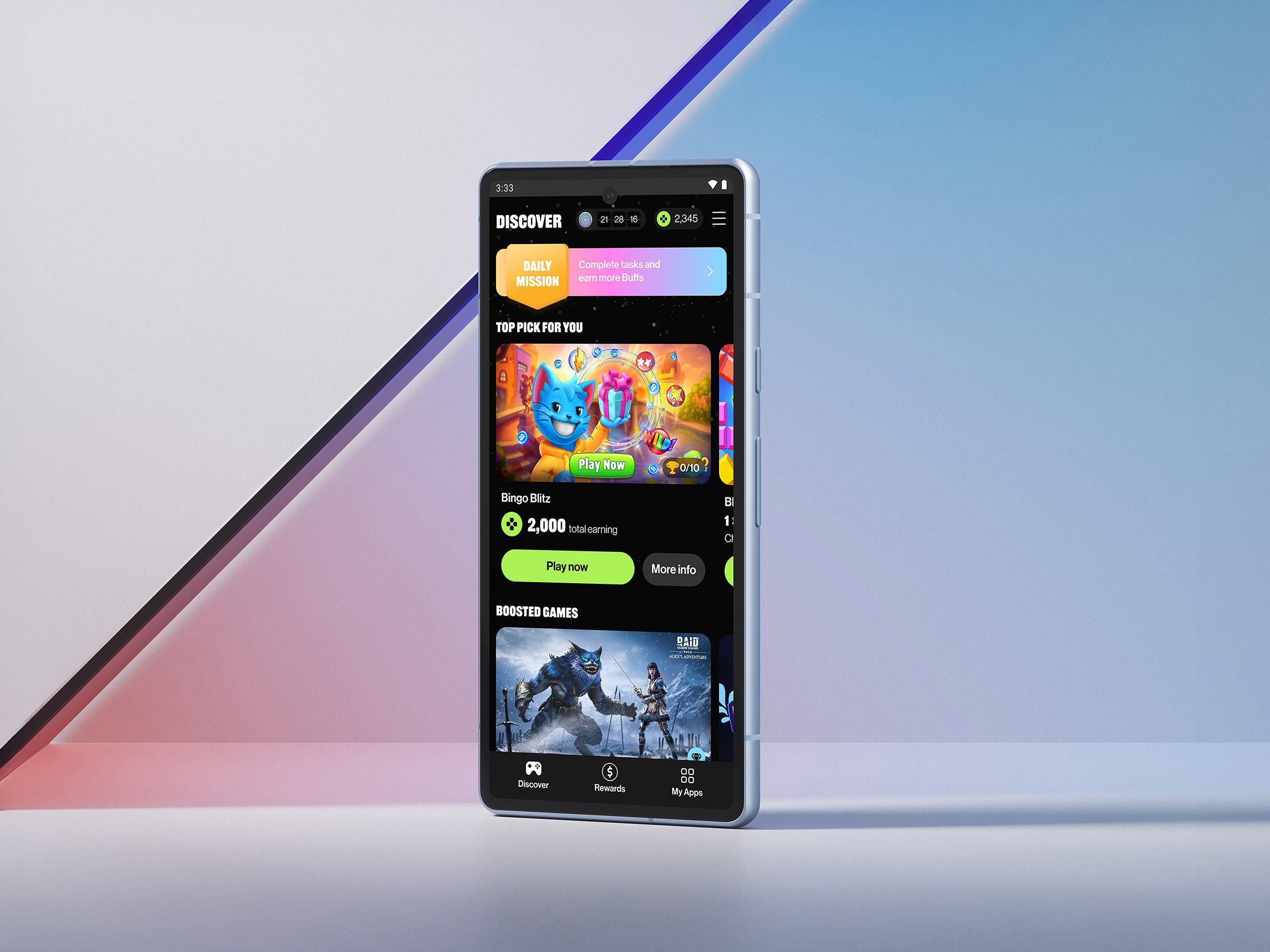

Industrial buyers, engineers, and procurement teams now research suppliers on phones. Most B2B websites are still built as if they were sitting at a desktop in head office.
Picture, for a moment, your most valuable industrial buyer. Not the imaginary one who sits at a clean desk with a fresh coffee and several uninterrupted hours to evaluate suppliers. The actual one. Standing in a hard hat on a construction site. Sitting in the back of a taxi between two project meetings. Hiding in a quiet corner of a trade show stand. Catching ten minutes between a delayed flight and a procurement deadline. That buyer is researching you on a phone. They are doing it whether your team has built for that scenario or not. And the data is increasingly unambiguous: more than half of B2B research now happens on mobile, and the share is rising every year. Most B2B website design has not caught up.
This is, on one level, a familiar story. The desktop-first habits of B2B marketing are a decade behind consumer marketing on almost every digital dimension. But on mobile, the gap matters more than usual. Because the buyer reaching for their phone in the middle of a busy day has less patience, less context, and less appetite for friction than any other audience your site has ever served.
Google’s joint research with Boston Consulting Group on mobile in B2B was unambiguous when it was first published, and the trend has only intensified. More than fifty percent of B2B queries are made on mobile devices. Forty percent of executive buyers report researching suppliers on a phone at least once a week, often outside business hours. And critically, mobile-led B2B research has grown fastest in the sectors most likely to involve buyers in operational environments: manufacturing, construction, energy, infrastructure, logistics, and field services.
These are exactly the buyers who cannot sit at a desk all day. Their job is on a site, in a vehicle, in a control room, or on a factory floor. When they have a moment to research a potential supplier, they have a phone and a few minutes. The site that loads quickly, presents clear information, and respects their time wins. The site that requires them to pinch-zoom, wait, swipe through a desktop layout shrunken to four inches, or fill in a form with a microscopic submit button gets closed and replaced by a competitor.
Across the mobile audits we run for industrial and infrastructure clients, the same four failures keep appearing in roughly four out of five engagements. Each is fixable. Most are fixable inside weeks, not quarters, and none requires the kind of brand reinvention that consumes eighteen months and three executive review cycles.
If your buyers are office-based knowledge workers, a poor mobile experience is annoying and slowly costly. If your buyers are operational, the same poor mobile experience is structurally disqualifying. The procurement officer in a manufacturing business who needs to evaluate three potential suppliers between two factory walkdowns will not be sitting at a desk later to do it properly. They will be doing it now, on a phone, with thirty seconds before the next meeting starts. The supplier who fits that constraint moves to the shortlist. The supplier who does not is quietly forgotten.
Forrester’s data on B2B research patterns adds the supporting context: time-to-shortlist has compressed in industrial sectors over the past five years, partly because buyers are doing more parallel research across more sources, often on mobile, before reaching out to any supplier. The site that fails on mobile is being eliminated before any conversation begins, often without your sales team ever knowing the inquiry was in play.
Mobile-first does not mean making the desktop site smaller. It means starting the design from the most constrained context and building outward. The headline has to land in three seconds. The value proposition has to be legible in landscape mode without scrolling. The contact form has to work with one thumb. The case study has to be scannable in ninety seconds while waiting for a coffee. Every design decision is made with the harder constraint as the starting point, and the desktop experience benefits from the discipline.
Practically, this means three things. Performance budgets enforced at every release, with page weight and load time monitored as primary metrics, not afterthought ones. A content hierarchy that puts the buyer’s most likely question above the fold on a phone, even if that means a less elaborate visual treatment. Forms and conversion paths that have been tested by real people on real phones, in real distracting environments, before they go live. None of this is exotic. All of it requires a discipline that most B2B website design programmes do not currently impose.
If you are a CMO, the practical step is to commission a mobile-only audit of your top five inbound landing pages, scored on load time, content clarity, and form completion friction. The findings will surprise you, almost always unfavourably. If you are a CFO, the practical step is to ask what percentage of your inbound conversions originate on mobile and how that number compares to your sector benchmark. If neither number is currently available in any of your reporting, that itself is the finding worth reporting.
And if you are a CEO, the practical step is to open your own website on a phone, on a 4G connection rather than office wifi, and try to find a specific case study or technical specification. Time yourself. The minute and a half of mild irritation that follows is the experience your most operational buyers are having every day. It is also, if your sales team is honest about it, the experience your competitors are quietly profiting from.
VIMI’s B2B website design practice runs structured mobile audits for industrial, infrastructure, and field-services clients. Within two weeks you will have a load-time, clarity, and conversion-friction analysis scored against published benchmarks, plus a prioritised remediation roadmap.
Schedule a consultation with VIMI’s B2B website design team at vimi.co. The first conversation is short, free, and structured around your actual mobile traffic.